Our Wedding Logo, Website, and Save the Dates
I think we can all agree: wedding planning is a HUGE project! When we started down this path, I had no idea how much of a process it would be to manage everything from start to finish (and we’re more than 6 months out from the wedding!) From from budgeting to vendor selection (check out this amazing cost estimator from WeddingWire), reviewing contracts to coordinating all of the little details, the wedding may be one of the biggest projects we’ve taken on.
As a project manager by day, I’m not unfamiliar with managing a large scale project through from start to finish. (Though, typically I get to spend someone else’s money and not my own!) Truth be told, I have loved the planning process and enjoy thinking through all of the little details to have a cohesive look and feel to all elements of our wedding. Today, I’ll be sharing three details of our wedding and how they all work together for that consistent vibe I’m striving for: wedding color palette, logo & wedding website, and our save the dates!
Wedding Color Palette
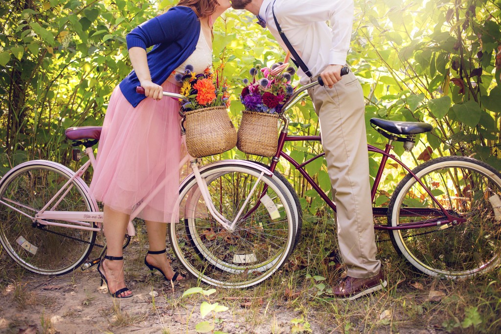
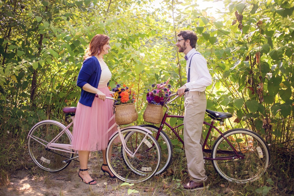
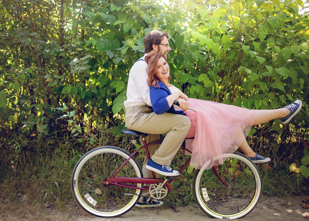
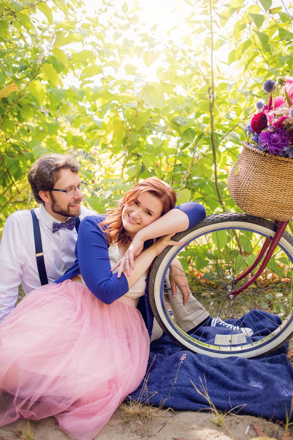
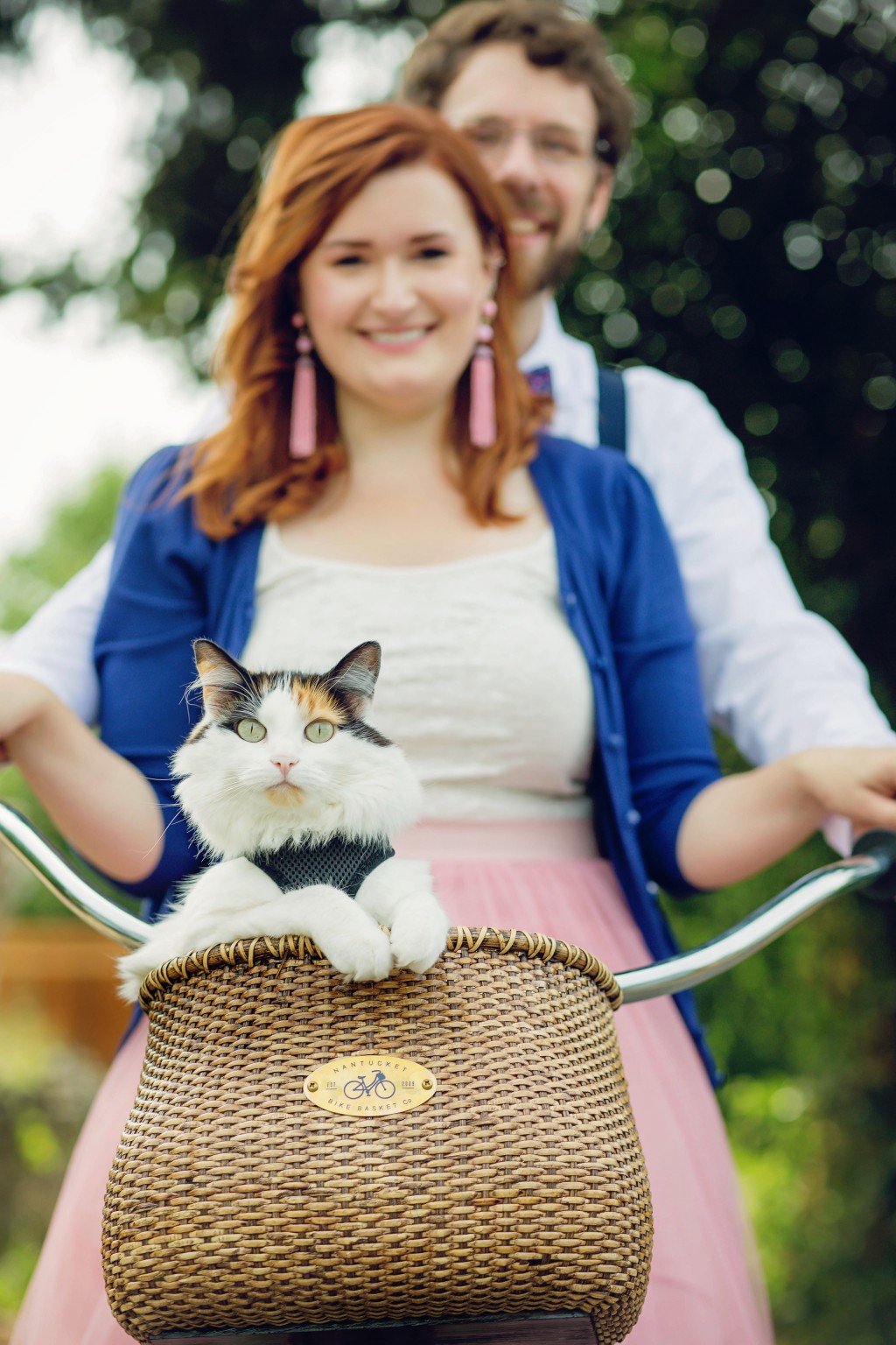
I had two priorities after we selected our wedding date & venue: engagement photos and selecting our colors for the wedding. My vision for our engagement photos involved two vintage beach cruisers that Jon refinished, so I wanted to ensure he didn’t have to paint them twice. Given that we’re having a fall wedding, I wanted to have a deep, rich hue as one of our main colors. We were debating between an emerald green, deep plum, and burgundy. Since I love all things pink, I thought it would be ideal to incorporate a shade of pink as well. Ultimately, Jon and I settled on burgundy and blush pink for our wedding colors. Burgundy is one of Jon’s favorite colors and obviously pink is one of mine. Once we had our two main colors selected, Jon set to work painting the bikes. We took in a burgundy color swatch that would match the bridesmaid dresses and Sherwin Williams helped us do a color match to ensure that the burgundy was a perfect match! You can find all of our engagement photos here. Be sure to check out WeddingWire’s Color Palette Generator for ideas on selecting your colors.
With our colors selected and our engagement photos taken, it was on to our wedding website and save-the-dates!
Wedding Website & Logo
As I started sifting through the many options for save-the-dates, I was struggling to find an existing design that I loved. I wanted to work in our colors and with existing designs that can be difficult to accomplish. I also knew that I wanted something unique and one-of-a-kind for us, so the idea of a logo popped into my head. My idea was that the logo would carry across our digital properties and paper products to create a consistent look and feel. The design idea for the logo came to me one night and I reached out to our friend Makara and asked if she could do the design for us (she also did my All Things Kate logo). Without further ado, here’s the logo that Makara created for us:

It was literally everything I asked for, including a little Opal in the basket of the blush pink bike! (Please note, we love Jasper too, but at the time we created this logo we hadn’t adopted him yet!)
Following the logo design, Jon and I got started on the website. Years ago, Jon had bought me the domain KateandJon.com after I commented that I wanted it. At the time, he was at grad school in Norway and the domain wasn’t available but he kept tabs on it and once it expired, he bought it and surprised me with it! We’d had plans for the domain to start our own blog there, but never got around to designing the site until our wedding.
Creating our wedding website was another big task that we undertook, since we decided to build a completely custom site. (Jon moonlights a web developer; he’s an Avionics Engineer by day.) I guess that’s par for the course because we’ve gone above and beyond on everything so far (painting our own bikes, creating our own logo, collecting our own china plates, and we’re currently renovating a 1957 Siesta camper for our wedding, too!) Luckily though, if you’re not engaged to a web developer like me, there are a ton of free resources out there to create your own wedding website! Here’s a peek at our website (you can view it in its entirety here).
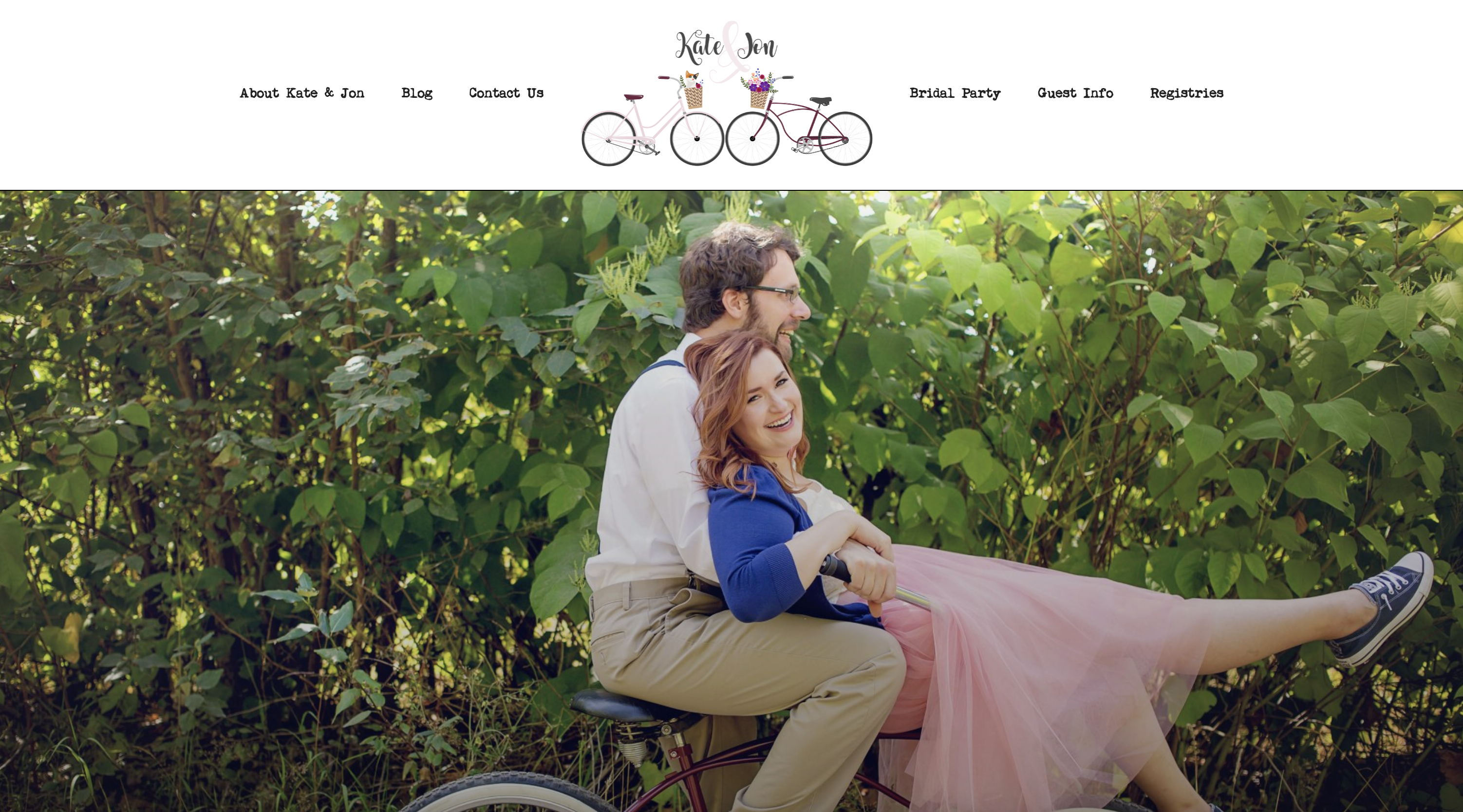
We relied on WeddingWire’s resources to prioritize what content we included for our guests, and to ensure we had the important details covered. It was honestly a ton of fun to put together the pieces and share our favorite things to do, favorite places to visit, and details about bridal party and families!
Save the Dates
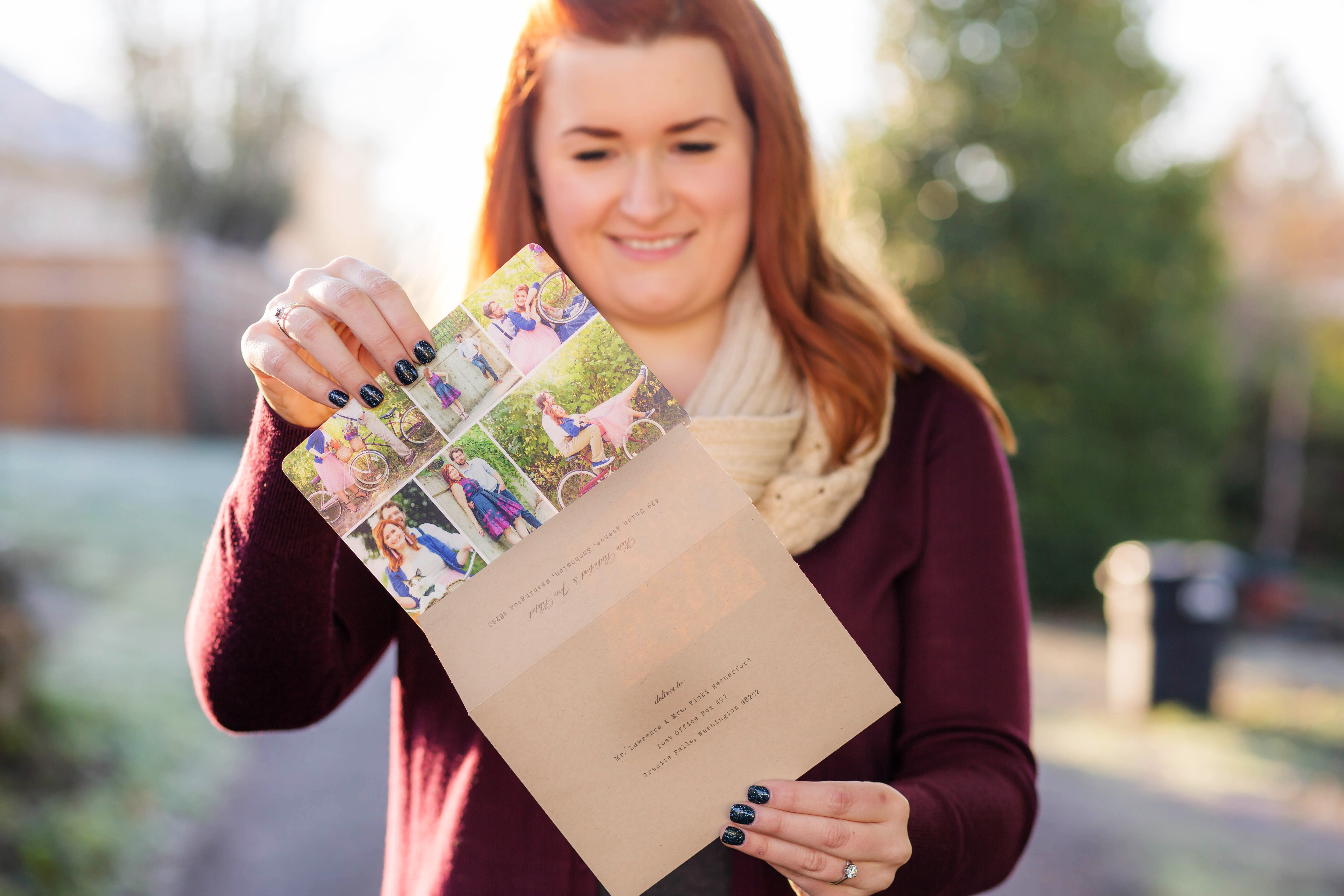
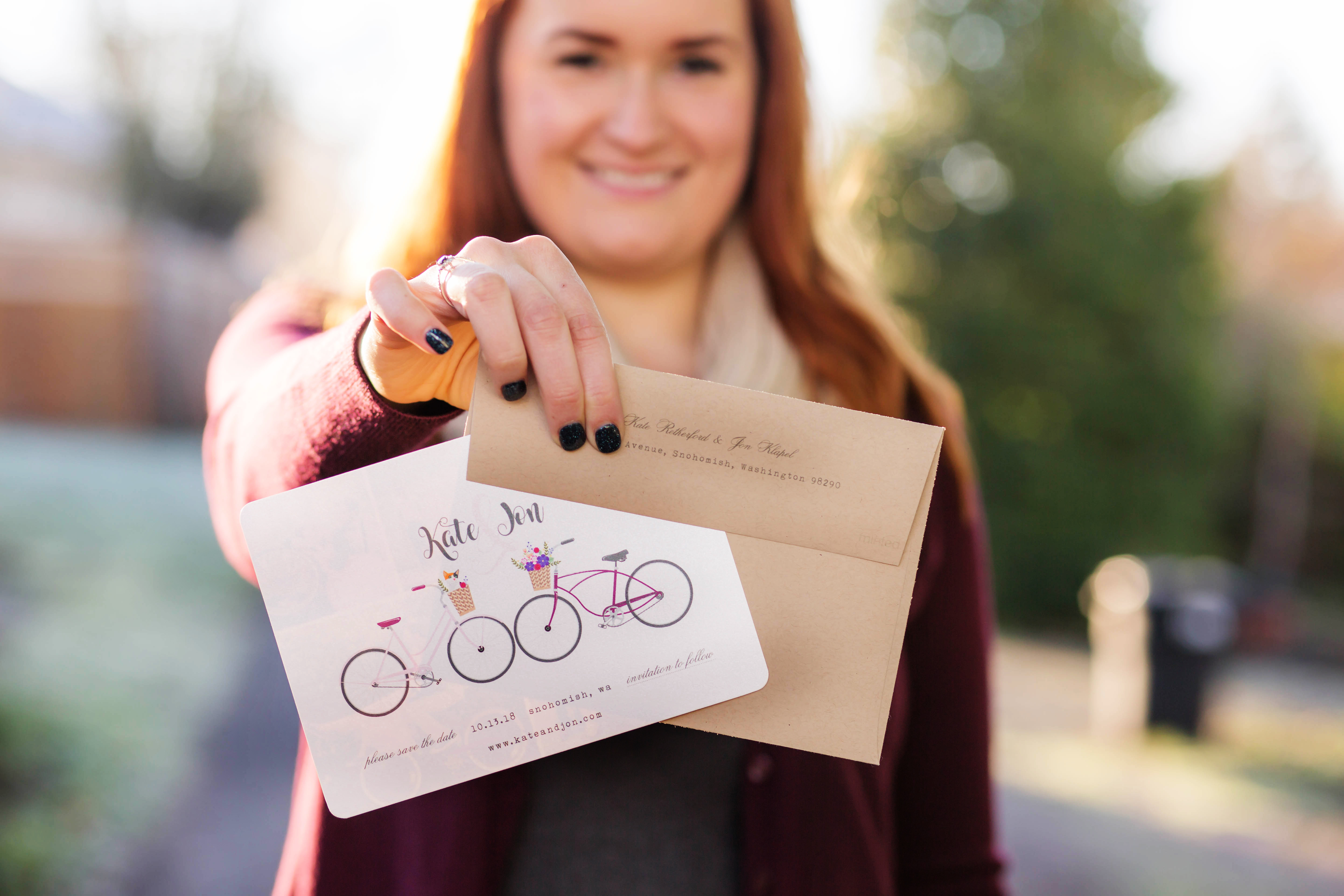
I’ve always been a fan of Minted‘s paper products, so it was a no-brainer to order our save-the-dates through them. Minted Weddings has numerous design options that are completely customizable from personalizing with images, font colors, paper selections, and more. I signed up to receive a sample kit so I could see and feel the Minted products before ordering. After reviewing the sample kit and getting some save-the-date inspo, I selected a pre-existing save-the-date design and requested that a Minted designer make a few tweaks to the design. Here’s the end result:
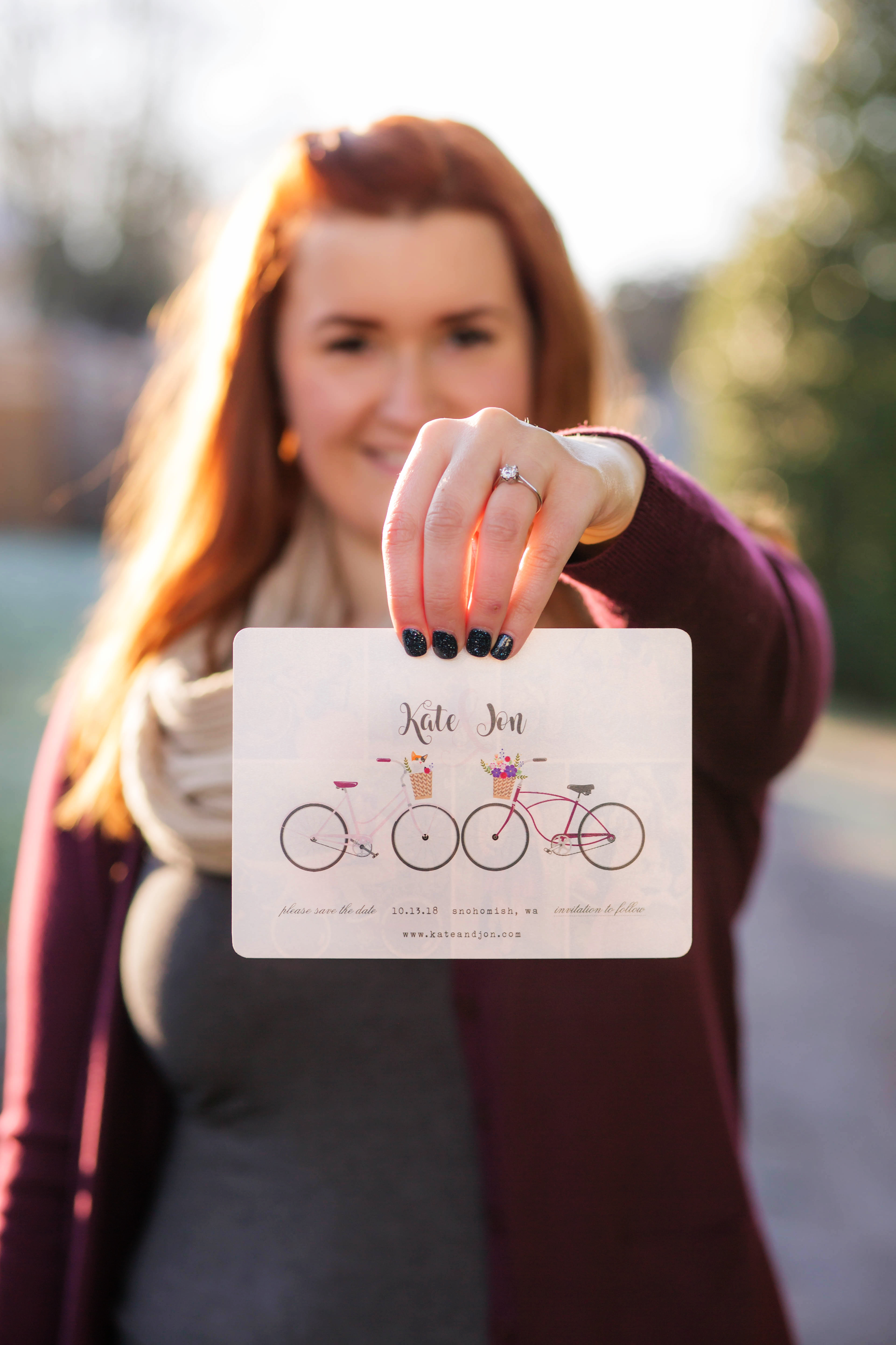
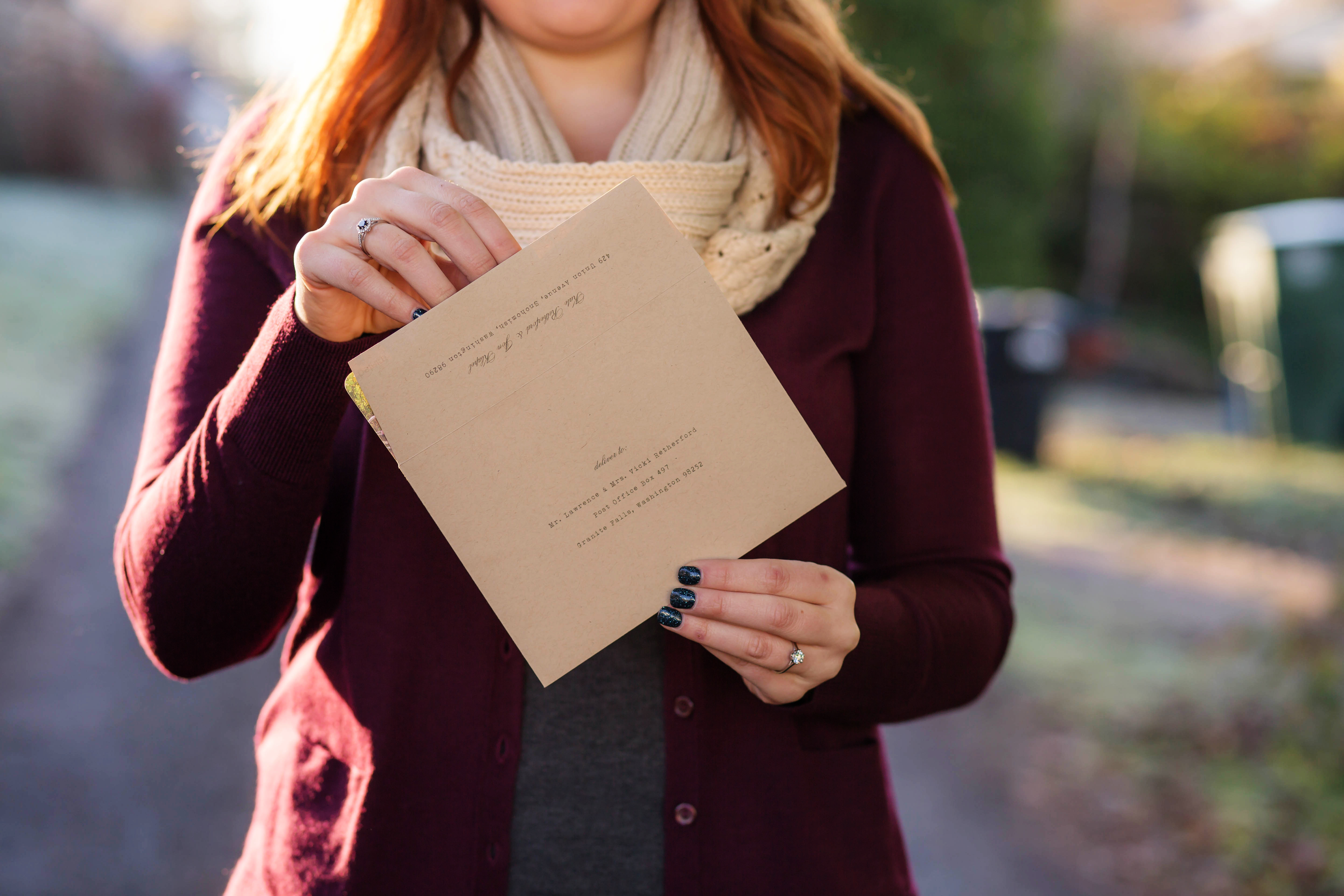
We also opted for the free recipient addressing and had our address printed, too. It saved so much time! If you’re considering ordering through Minted, use my referral link for $25 off your first purchase of $100 or more!
What’s Next
We’re really pleased with how the pieces have come together thus far. With the color palette, website, and save the dates out of the way, we can start working some of the finer details in preparation. We’ll be working on our invitations next, the vintage trailer will be a multi-month project, and sometime soon we’ll be getting Jon in to try on suits!
Created in partnership with WeddingWire
Logo designed by Makara Sernett
